Friday, 14 February 2014

Evaluation / Q4

How did you use new media technologies in the construction & research, planning and evaluation stages?

The construction, research, planning and evaluation of these media products involved using various new media technologies. The beginning of the project involved using YouTube to investigate existing music videos in a genre that interested me. This platform gave me access to thousands of current music videos that I could use as inspiration for my own production and that I could analyse in order to find codes and conventions that I could decide to follow or challenge. During this research section I also used various social media sites such as Facebook and Twitter to investigate my target audience and how similar (but more well established) artists to David Stewart such as Drake and The Weeknd accessed their audience. I also used Facebook as a way of contacting the artist and gaining permission to use their track for my music video.

The production of my music video involved using hardware such a DSLR camera that could produce HD 1080p footage. This made filming easier and ensured that I would produce a finished product that was to the highest standard possible for an amateur video. Post production involved editing using Final Cut Pro. This software enabled me to cut clips together, adjust speed/direction, add smooth transitions and use various effects such a overlays, masks and colour correction. These features were essential to the creation and success of the finished product. Whilst using this software I also downloaded a plug-in that allowed me to reduce noise from the original footage in order to lessen some of the grain resulted by filming in such low light conditions. Production of the ancillary texts used mainly Photoshop, which meant I could edit images, add text and objects, adjust colours and make interesting layouts. It was

In order to exhibit and promote my finished music video I used various social media websites. I first uploaded my music video onto YouTube, because as my target audience research results showed, this is commonly used for discovering new music and has also become an expected platform for presenting music videos. I followed this by sharing the video on Facebook and Twitter, two main social media sites which seem vital in the success of new musical release as they have great advertising capabilities and suit the target audience of David Stewart.

The actual presentation of this whole project as media coursework involved using various media technologies as well. Blogger is the platform I have used to show my research, planning, construction, production, post production and finished products. This has been helpful in keeping my work tidy and organised, whilst being able to order things correctly and go back and edit sections when needed. I have also used SlideShare to help put PowerPoint presentations on my blog used for the research section and YouTube to embed videos on my blog used during the research and evaluation stages.

Monday, 3 February 2014

Evaluation / Q3

What have you learned from your audience feedback?

I discovered from my target audience research that I was aiming for my music video, magazine advert and digipak to appeal to a young adult audience who were keen social media users and interested in discovering new up and coming artists. I did this by creating a unique, artistic music video with complimentary advertising products that were bold, stylish and colourful. I am now going to conduct a second questionnaire asking what people thought of my finished products:

Music video feedback

1. What do you think is the biggest strength of this music video?
2. What do you think is the biggest weakness of this music video?
3. How is this music video similar to existing products?
4. How is this music video different to existing products?
5. Do you have any suggestions for possible improvements to the music video?
6. In terms of overall success and appeal, what would you rate this music video out of 10?

Magazine advert feedback

1. What do you think is the biggest strength of this magazine advert?
2. What do you think is the biggest weakness of this magazine advert?
3. How is this magazine advert similar to existing products?
4. How is this magazine advert different to existing products?
5. Do you have any suggestions for possible improvements to the magazine advert?
6. In terms of overall success and appeal, what would you rate this magazine advert out of 10?

Digipak feedback

1. What do you think is the biggest strength of this digipak?
2. What do you think is the biggest weakness of this digipak?
3. How is this digipak similar to existing products?
4. How is this digipak different to existing products?
5. Do you have any suggestions for possible improvements to the digipak?
6. In terms of overall success and appeal, what would you rate this digipak out of 10?


Looking at the results from my questionnaire I feel that the strongest points of my project are its simplicity, how the three products link well together, their professional style, interesting colours, editing, striking imagery and good photography. It has also helped me notice the weak points such as not enough variety of shots, a large amount of plain background on the magazine advert, a lot of dark images, lack of eye contact in some photos, no detail about release dates and the same setting throughout the whole video. Suggestions about what to change about my three products include more variety of shots, more action/movement at the beginning of the video, no black border on the magazine advert, even brighter colours, different fonts on the digipak/magazine advert and potentially the introduction of a male dancer. Here is some evidence of feedback I received off various social media:


Thursday, 30 January 2014

Evaluation / Q2

How effective is the combination of your main product and ancillary texts?

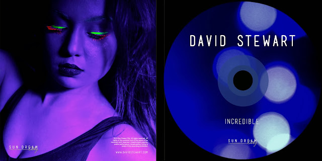
I think I have effectively combined the three components of my finished product as a whole. The magazine advert and digipak help provide an understanding of the music video and act as good advertisements for my main product. There are many similarities amongst both the ancillary texts which go on to compliment the main production. The diagram below illustrates many of the similarities between the magazine advert and the digipak. These are things such as the same font being used across all components of the advert and CD designs. There is also a similar layout using black borders and outlines to define images and allow text to be clear and readable. The same image is used on the magazine advert as the inside CD cover and the same photo used on the CD itself is on the CD back cover - this brings the two elements together and creates continuity between the designs. They also both have similar information such as record label logo and website, this is important advertising detail and ensures the viewer knows where/how to access the artist.


Many of the shared elements across these two products also apply to the music video. Not so much with text, because this is quite absent in the video, but very much so when it comes to the colour scheme being quite dark and atmospheric but with the contrast of neon paints, the subject being the same across all three components along with her posture, expression and make up, and the abstract style which remains obvious amongst all three products. However, there are also differences amongst the three elements, such as the amount of text on each product. The music video has no text whatsoever and this is because I do not feel it necessary to the video, it would only be a distraction and the viewer has enough information to process without text getting in the way. It is also the main product and therefore does not directly fulfil an advertising purpose, and it is text that is useful in promoting a product as well as successful images. The magazine advert has very little text in comparison to the digipak, and this is because it is a less informative product and instead something that needs to grab the attention of the viewer and communicate information to them as quickly as possible. Another difference between the three products is the content of the images. Whereas images on the magazine advert and digipak only contain the face & shoulders, the music video contains different shots of the dancer's full body. It also contains images of the dancer covered in body paint which does not feature on the ancillary products. I like the fact that this element is only present in the main product because it's a feature that isn't shown by the magazine advert or digipak and so is made more exciting to watch.

Wednesday, 29 January 2014

Evaluation / Q1

In what ways does your media product use, develop or challenge forms and conventions of real media products?

The music video 'Incredible' uses many conventions of current existing music videos but also challenges them in a few ways too. It is similar to most current music videos in the basic way that it is shot widescreen in HD. Many different shot types are used and there is a clear beginning, middle and end, which most music videos have in order to create a satisfying finish for the viewer and some kind of climax to continue engaging their attention throughout. I looked at various different existing music videos as inspiration for my own creation, and took many aspects from them when filming and editing 'Incredible'. One music video in particular that helped shaped the way I expressed the meaning of the lyrics in the song I used, was Ed Sheeran's video for 'You Need Me, I Don't Need You'. In this production, the lyrics are expressed through sign language and not the artist singing himself, this adds an alternative and creative twist which I liked very much, and I also found it gave a deeper meaning to the lyrics and allowed the viewer to appreciate the song in a new/different way. The concept for my video is quite simple in comparison to many existing music videos, which itself is slightly challenging forms and conventions. Unlike most contemporary music videos at the moment, the style of 'Incredible' follows more of an artistic narrative rather than a live performance or classic narrative approach. Despite this style challenging conventions of quite a few media products from my genre, I in fact took inspiration from a current music video by Lorde for 'Tennis Court', whose unique creation inspired me to develop a simple yet striking piece of work, that told a story through expression and movement. Some would say my finished music video challenges forms and conventions in other ways too. For example, it has quite a unique colour scheme, not many current videos from my genre use UV light or neon paint, but I wanted to make that a unique quality of my video which would make it stand out and also allow it to be a recognisable aspect for the viewer which would then transfer to the magazine advert and digipak. Modern/ballet dance is the main focus of my music video and this is not a common type of dance used in pop videos, the representation of the female lead is also different because she is presented is a much less provocative manner in comparison to many of the pop videos I viewed when looking for inspiration. Another convention challenged by my video is the use of a female lead for a male sung song, along with the fact that the male singer does not feature at all. I have not seen this much in current music videos, other than the fact that Ed Sheeran only features for a few seconds at the end of his video for 'You Need Me, I Don't Need You'. This is an aspect that was not originally planned, but came about when I realised I had no access to a male dancer. It is now something which I feel helps keep my video original, and allows the viewer to focus on the lyrics from the female point of view rather than get muddled between the man's viewpoint as well. It also further establishes the abstract, artistic style I was aiming for with my finished product.

The magazine advert and digipak follow forms and conventions of existing products a lot more than my music video. I felt this was important because they are both key advertising products in making the single and video successful and therefore breaking too many conventions could hinder their effectiveness. The layout and size of both the magazine advert and digipak designs follow most conventions of the existing examples I analysed. In terms of size, the magazine advert is in portrait A4, like most existing products, so it takes up one single page of a magazine, and the digipak is the size of a normal CD. The layout uses conventions such as the components of the advert and digipak being spaced out from each other so that it is easy on the eye, as little text as possible is used (only what is really necessary such as the album title) meaning there is less information to process, images are on the magazine advert and all three parts of the digipak to add visual appeal, small print is hidden from the main point of focus and important text such as the track names and album title are centred to help the layout look attractive to the reader. The colour of the magazine advert and digipak follows conventions in that it is the same across both media products, and also follows the colour scheme of the music video, thus being a recognisable feature of the products as a whole. The colour scheme itself being UV/neon is slightly unusual for the genre, but I feel it adds a unique appeal to all three products. There is not any text used across the two products that does not use forms of existing products - on both you see the album title and artist, record label logo and website. On the magazine advert you also see the line 'the new album' which I found on various existing examples. The digipak also includes track names and small print about copyright information which you will find across all CD back covers. The type of images used (eg. close up portraits) and their positioning uses conventions of existing products, however, the subject of the main images does not, due to the fact a female is used to present a CD sung and produced by a male. Still, she is the female subject from the music video, and therefore associated with the track. I think overall, although the music video itself is more of an abstract creative vision and therefore challenges many conventions of current pop videos, the complimentary magazine advert and digipak closely follow forms and conventions of exsisting examples and therefore should help with the success of the slightly more unusual video.