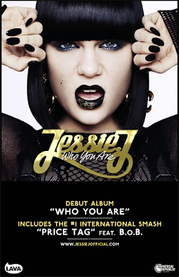
This is a magazine advert for Jessie J's album 'Who You Are'. The general colour scheme is quite bold with the contrast of black and white, and the gold text adds a point of interest for the viewer and connotes money, fame and royalty. The colour scheme of the text is carried on into the main image with the contrast of Jessie's pale skin to her black nails and hair, along with gold glitter on her lips. This links the different aspects of the magazine advert together and makes it appealing as a whole. The main image itself contains the whole of Jessie's face, her arms and shoulders. She has direct eye contact with the viewer and her mouth is open in a slight shocked expression - both these things engage the viewer and helps maintain their interest. The positioning of her arms help with the layout of the magazine advert as they ensure there is no large white blank space. Everything on this magazine advert is centred, including all text and the main photo, this makes it easy reading for the viewer and pleasant to look at. Jessie's name in her signature font is positioned in the exact centre of the page making it the focal point. Underneath this is the name of the album being promoted, so the two most essential parts of the advert are in the viewer's direct point of view. At the bottom half of the page, a black box covers the image and makes subsequent text such as included tracks and her website very clear to read. These pieces of information are separated by lines as they are not directly related and it is essential that the information on an advert is quick to process.

No comments:
Post a Comment