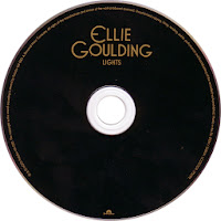
This is the CD front cover, back cover and CD design of Ellie Goulding's album 'Lights'. There does not seem to be a particularly obvious colour scheme for the design, but the three components are in general quite dark with lighter contrasting text, reflecting the title of the album and maybe its content too. The chosen typeface is quite a unique font and consistent with other Ellie Goulding albums and singles, providing a focal point that the viewer can associate with the artist. Most of the text is in an off white or gold, complimenting the colours in the main image and bringing all three components together as one. Similar to the previous two digipaks, the front cover simply contains the album artist and title, small print about copyright and record label information is situated on the back cover and CD itself. All parts of the covers and CD design are centred, making it easy on the eye and appealing to the reader. There is only one image which takes up the whole of the front cover, it is a close up photo of Ellie Goulding, most of her face is covered by shadow, but a bokeh effect has been used to add a point of interest to the image and reflect the meaning of the album title.


No comments:
Post a Comment